This Very Website
This Very Site
I created this website as a demonstration of my skills and representation of my brand, my ambitions, and my web development skills.
Responsibilities
UX research, moodboard, wireframes, mockups, HTML/SCSS
Goals
- Take on all the roles and responsibilities involved in a website launch, from ideation to post-launch.
- Define a personal brand identity, including logo, color palette, and moodboard.
- Showcase my design and HTML/CSS skills, and expand my accessibility and UX design proficiency.
- Create an online presence to connect with other designers and developers around the world.
Process
Research
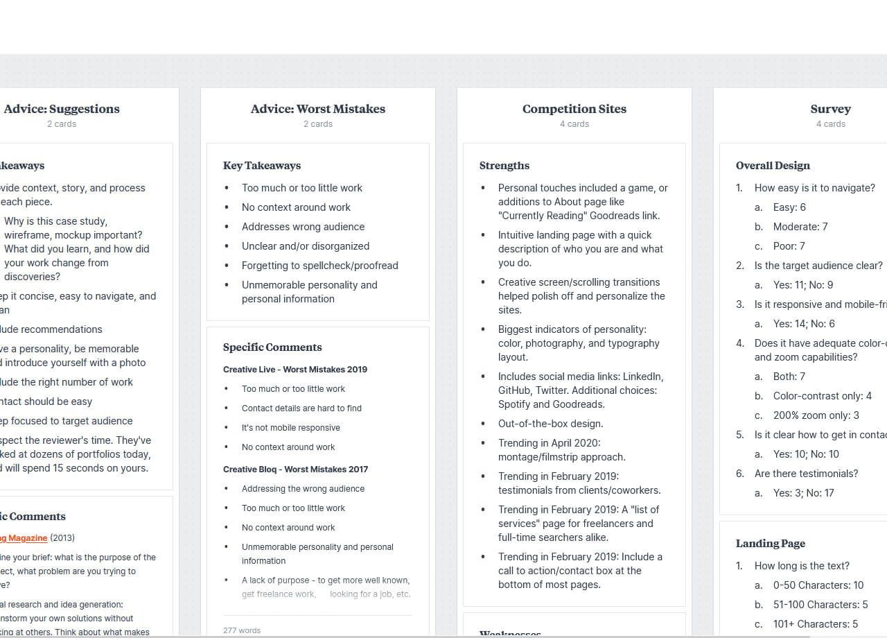
I began my research by reading articles on how to develop a personal portfolio. The same suggestions kept appearing: don’t include too much or too little work, keep it concise and easy to navigate, and have a personality.
With these commandments in mind, I began researching personal portfolio websites. I put together a list of questions as I reviewed them, ranging from “does it have adequate color-contrast and zoom capabilities?” to “what is the focus of the about page?” to “how many words do they average per project?”
Strategy
I next created a persona for each of my expected target audiences:
- A recruiter with limited technology experience.
- A lead web developer reviewing screened applicants.
- A product manager quickly glancing at sites before interviews.
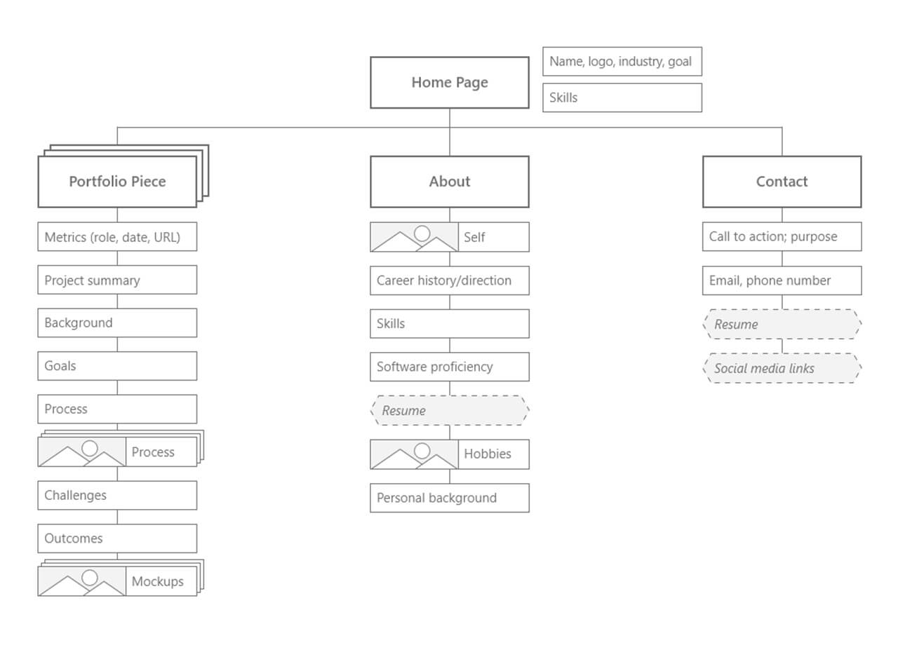
After considering my notes, I put together a list of content and functionality requirements.To keep project scope manageable, I included just the core of what I intended to develop, and created a document detailing functionality, asset descriptions, and text for each page.
Design
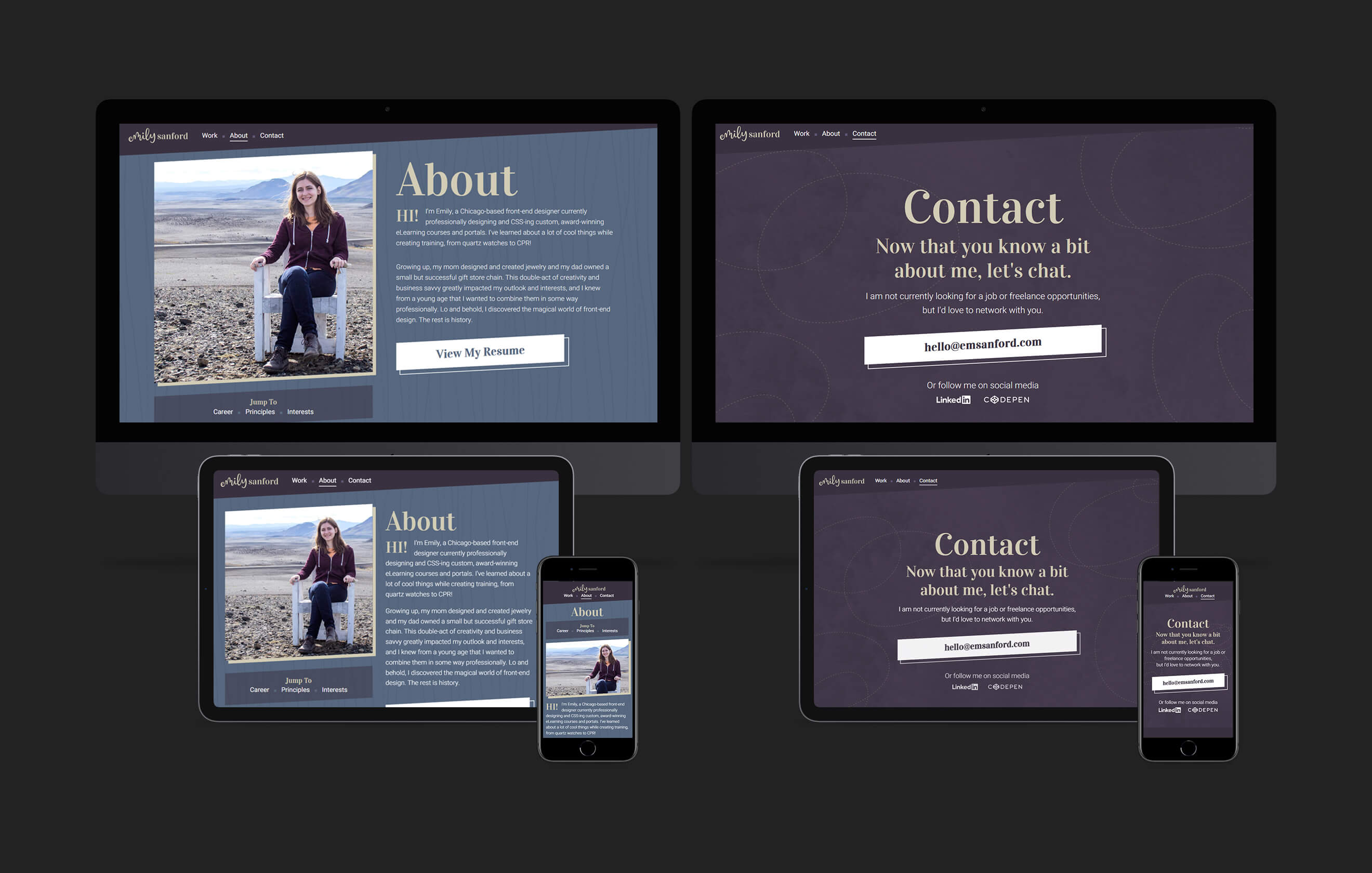
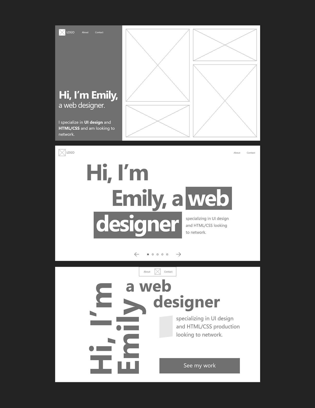
I initially focused on wireframing just one page to keep things simple as I decided on a basic approach. I settled on three layouts that I then expanded into three unique approaches.
Next: a loose moodboard where I experimented greatly with color and typography. To allow for the most flexibility, I kept it simple and fluid. I spent time finding inspiration from Dribbble and Awwwards before beginning mockups. To keep the focus narrow, I chose a single page to explore different UI design directions, iterating as I went.
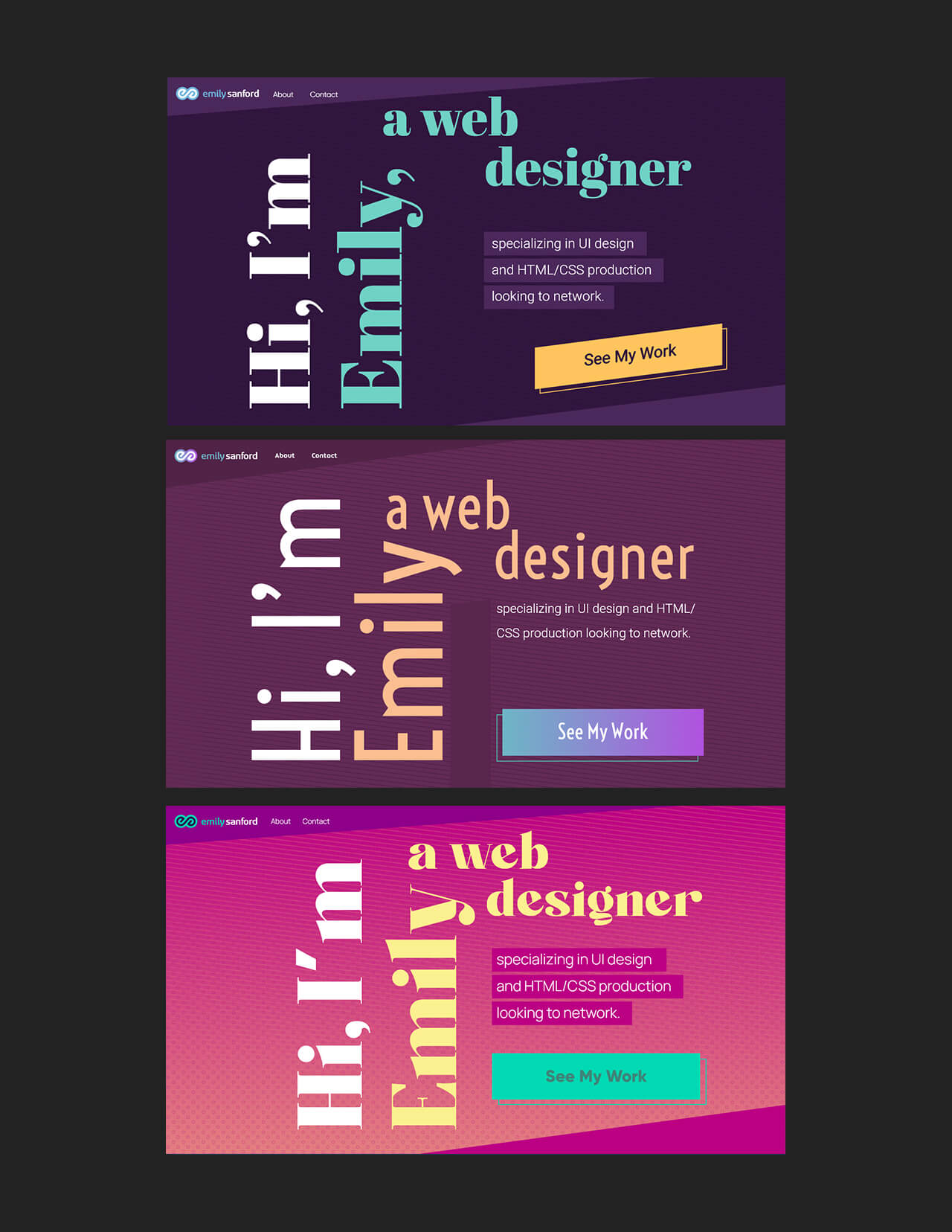
The mockups were completed with a retro influence. I created prototypes and shared them with designers, developers, and others outside the industry, and received helpful feedback on the design direction.
Production
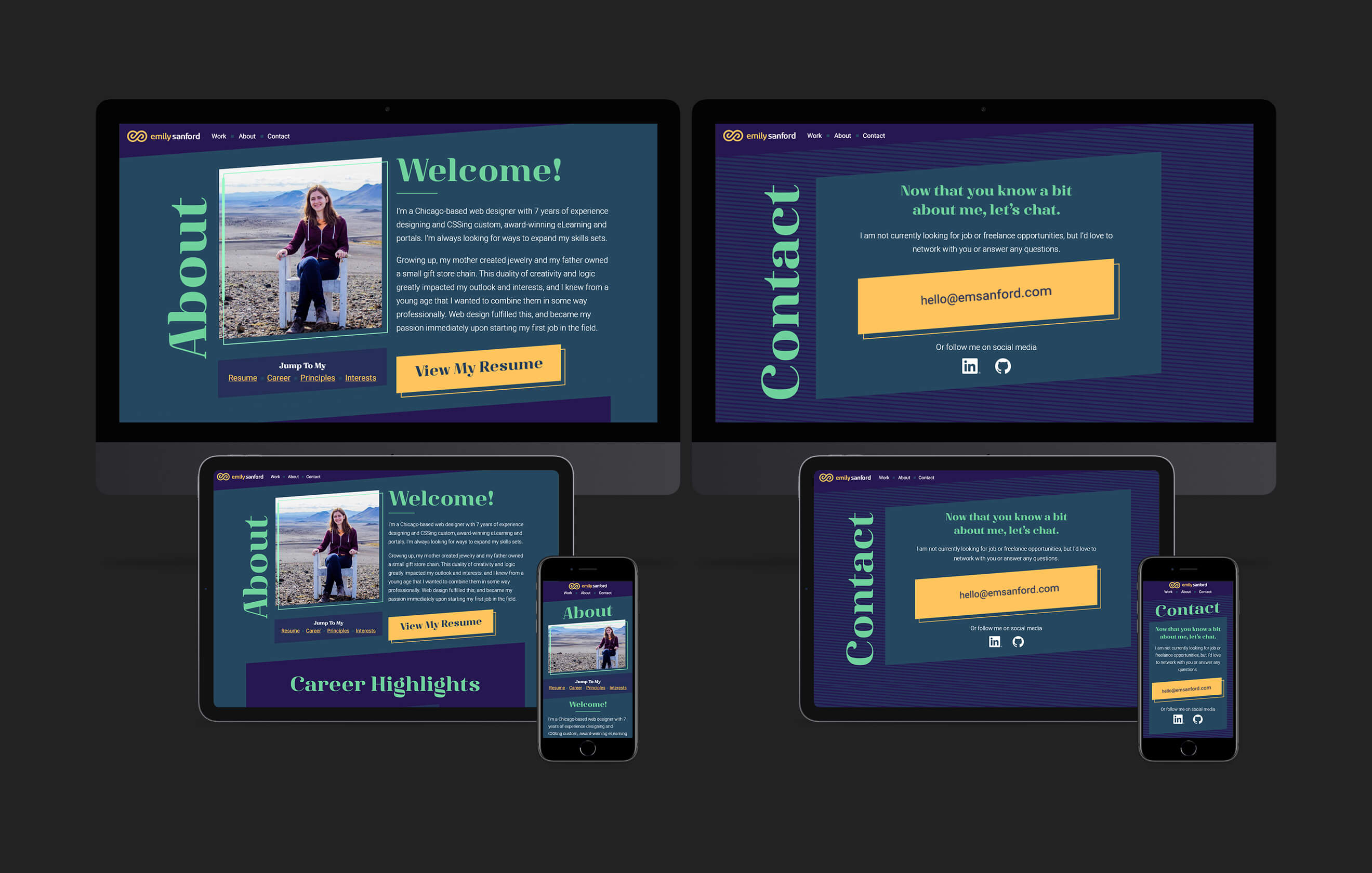
I spent some time reviewing the Web Content Accessibility Guidelines (WCAG) before creating HTML to better familiarize myself with accessibility and ensure I kept it a priority. This concern for accessibility led me to create the HTML for each page before beginning CSS, to ensure everything on the site is able to be experienced without any CSS or JavaScript.
I often work with clients who need to support Internet Explorer 11, so I wanted to make sure my proficiency in IE11 support was emphasized, which led me to use SCSS. File maintainability and organization are very important to me, so I went through multiple rounds of clean-up.
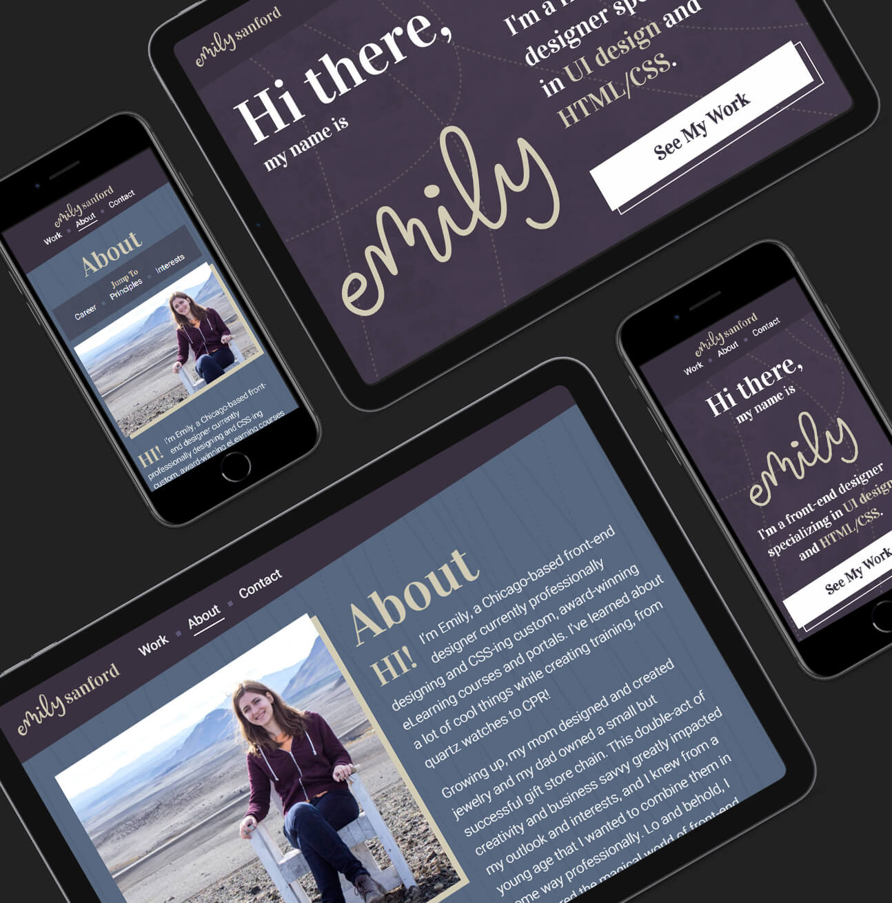
Rebranding
After taking some time away from the project, when I came back to it, I realized I wasn’t very happy with the overall visual design. I still believed the layouts were strong, so I focused on refreshing the colors, patterns, and fonts. I also decided to finally take a hard look at my logo, reworking it from the ground up until I found something that I felt reflected my personality.
Since I only adjusted colors, patterns, and fonts, it was very easy to update the CSS with my new design. That brought me to the home stretch: final accessibility and cross-browser testing, and then—go live!
Challenges
Defining a personal branding identity
I’ve primarily worked on projects with existing brand standards.
A saying at my previous job has always stuck with me: constraints force innovation. I gave myself a set amount of time to create multiple approaches. This forced me to make decisions on the spot instead of iterating for the sake of iteration.
However, the greatest help was taking a break from the design and coming back with fresh eyes. I was looking in the wrong places for inspiration: other designers’ work. By focusing instead on inspiration from other sources that influenced my life, like video games and the natural world, I was able to create an identity that accurately represents me.
Reigning in scope creep
I kept wanting to add and learn new things—GSAP animations, CUBE CSS, and a static site generator to name a few.
It was actually a developer friend’s suggestion that helped keep me in check. I told him about beginning this project, and he suggested I stick to just HTML and CSS for the initial launch—I can add more later. This simple statement resonated with me throughout each stage of the project.
I additionally kept scope reigned in by defining my functionality and content needs early, and checking back on that document as production progressed.
Outcomes
Since this is my own portfolio website, the work is never done. I look forward to tracking my analytics, receiving feedback, and exploring adding new features.